Monday, January 5, 2015

SmArt school #5

 This was the art director assignment. I chose to work on Karen Berger's spec Vertigo Comics cover assignment. She asked for a half angel half demon with a man (in jeans and a T-shirt) in a moonlit graveyard. So here are my thumbs. Rebecca wanted me to rework the composition on the one in the colored box. She talked with me about ways to do it.


So I came back with this revised rough drawing and I got the go-ahead.


I made my frankensteined reference.


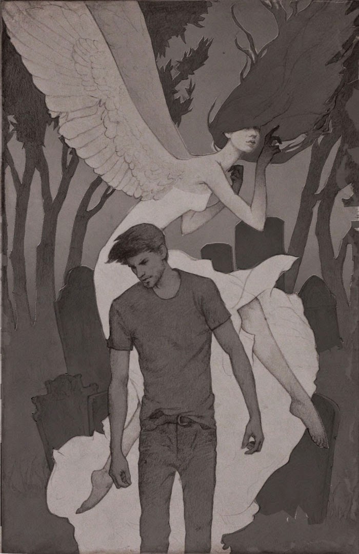
My final drawing that needed a few slight adjustments before moving on...


My value study.


I chose the end top right of the color studies...


When I showed my finished piece to the Art director, I had mostly positive feedback. I needed to darken the man's hair and clothes for contrast. Adjust the value of the angel/demon's hair and obscure the lower of her feet (the one behind the man's hand) behind sheer fabric so the area wouldn't look so busy. Below is the finished painting with the changes.


SmArt school #4

So Rebecca gave us a prompt for this one. Robin Hood as a girl either traditional time period, modern, or futuristic. Below are my thumbnails. We chose the bottom row center, however it was pointed out to me that her costume could be mistaken for Katniss Everdeen, so The next step was to explore costuming!

I tried a broad assortment of options. We went with #3, the military jacket and pants.


I then collected and hacked up photos to get my reference. Pretty awesome, right?

Here is the finished drawing


 and the underpainting.


Color studies.


I chose #2 and then decided to try out adding a decorative element. I drew some thistles in my sketchbook and then manipulated them in photoshop until it overlapped the girl the way I wanted.


I have to admit it was a bit tedious but I really like the end result. Behold my finished painting below!


SmArt school #3

For this next piece Rebecca recommended I try starting out with a photo I loved and I developing it from there. So I found some photos I thought were interesting and sketched them out in my book just to see how I felt about them. I went with a photo of a boy that I found compelling.


I decided I wanted him to be walking in front of a mural that would be coming alive behind him.  I made a few different concepts around that. There were others, but I set them aside and played with the ones below a little more to try some varied compositions. I went with the one in the bottom right corner.


Here is my finished drawing.


I took my drawing into photoshop and started trying out color palettes. I had a hard time picking just one when there were so many interesting directions to go with. I showed them to Rebecca and she actually suggested I add some large shadows to bring the focus in to the boy's face a little more. She said any of the color palettes could work first she played with 7 and then with 1. 


After class, I made a few adjusted color studies. 


From there I decided I liked the mood created by the blue green palette better even though I loved the red tigers too! (so hard to choose!) 


Here is a partially colored underpainting. (it's kind of an ugly stage)


Rebecca s gave me some suggestions for finishing touches (warm highlights on the boy, yellow eyes and a little more glow in the stripes for the tigers) to make it look complete. And here is the finish! I'm happy with how it turned out.


LinkWithin

Related Posts Plugin for WordPress, Blogger...