Saturday, May 16, 2015

Smart School Spring Semester

 My second semester at Smart School is just about over. Here are my finished pieces!

"Tender Briar" 12X18, oil
This is the most recent one. I used my eldest son as the model for this one. It is not intended as a portrait of him but it is a good likeness all the same. Rebecca reminded me of the importance of using everything good in the reference. 

"The Golden Bird" 8X12, acrylic
This one is based on the fairytale by the same name. In my sketch the man was beardless but I used my husband as reference and liked the beard, so I decided to use it!

"For a Rose" 10X18, oil
This one is basically what it looks like. A version of La Belle et la Bete. :)

"The East Wind Came" 12X24, acrylic
I just really like the imagery in this idea. The juxtaposition of the girl emerging from a cloud upside down and the bird passing by right side up.

Monday, January 5, 2015

SmArt school #5

 This was the art director assignment. I chose to work on Karen Berger's spec Vertigo Comics cover assignment. She asked for a half angel half demon with a man (in jeans and a T-shirt) in a moonlit graveyard. So here are my thumbs. Rebecca wanted me to rework the composition on the one in the colored box. She talked with me about ways to do it.


So I came back with this revised rough drawing and I got the go-ahead.


I made my frankensteined reference.


My final drawing that needed a few slight adjustments before moving on...


My value study.


I chose the end top right of the color studies...


When I showed my finished piece to the Art director, I had mostly positive feedback. I needed to darken the man's hair and clothes for contrast. Adjust the value of the angel/demon's hair and obscure the lower of her feet (the one behind the man's hand) behind sheer fabric so the area wouldn't look so busy. Below is the finished painting with the changes.


SmArt school #4

So Rebecca gave us a prompt for this one. Robin Hood as a girl either traditional time period, modern, or futuristic. Below are my thumbnails. We chose the bottom row center, however it was pointed out to me that her costume could be mistaken for Katniss Everdeen, so The next step was to explore costuming!

I tried a broad assortment of options. We went with #3, the military jacket and pants.


I then collected and hacked up photos to get my reference. Pretty awesome, right?

Here is the finished drawing


 and the underpainting.


Color studies.


I chose #2 and then decided to try out adding a decorative element. I drew some thistles in my sketchbook and then manipulated them in photoshop until it overlapped the girl the way I wanted.


I have to admit it was a bit tedious but I really like the end result. Behold my finished painting below!


SmArt school #3

For this next piece Rebecca recommended I try starting out with a photo I loved and I developing it from there. So I found some photos I thought were interesting and sketched them out in my book just to see how I felt about them. I went with a photo of a boy that I found compelling.


I decided I wanted him to be walking in front of a mural that would be coming alive behind him.  I made a few different concepts around that. There were others, but I set them aside and played with the ones below a little more to try some varied compositions. I went with the one in the bottom right corner.


Here is my finished drawing.


I took my drawing into photoshop and started trying out color palettes. I had a hard time picking just one when there were so many interesting directions to go with. I showed them to Rebecca and she actually suggested I add some large shadows to bring the focus in to the boy's face a little more. She said any of the color palettes could work first she played with 7 and then with 1. 


After class, I made a few adjusted color studies. 


From there I decided I liked the mood created by the blue green palette better even though I loved the red tigers too! (so hard to choose!) 


Here is a partially colored underpainting. (it's kind of an ugly stage)


Rebecca s gave me some suggestions for finishing touches (warm highlights on the boy, yellow eyes and a little more glow in the stripes for the tigers) to make it look complete. And here is the finish! I'm happy with how it turned out.


Tuesday, November 4, 2014

SmArt school #2

I wanted my second piece at SmArt School to be based on the book Stardust by Neil Gaiman. I wanted to paint the character, Yvainne (a fallen star). I wanted her to appear otherworldly, like her hair and dress were being pulled back up to the night sky. I also wanted to show the silver chain that was used to hold her captive for a time by Tristram. I showed some quick thumbnails to Rebecca to have the idea approved. 


 She recommended I work on the flow of the composition and gave the following examples:


I went crazy with the thumbnails to see what I could come up with. I narrowed it down to three that I felt were the direction I wanted to go (1, 2, & 17) and showed those to Rebecca. We decided to go forward with #2.


I put together some frankensteined reference using my head and arms, some random photos for a torso (I'm pregnant so I couldn't use mine!) and an assortment of blowing dresses.  I distorted the figure reference by elongating the neck and arms and even the fingers to get the form I wanted. 

My husband gave me some feedback and helped me come up with the idea that embers or fire were coming off her hair. So, I was playing with having her hair look like it was glowing and a little on fire with burning bits floating off, kinda like a shooting star. Rebecca recommended I simplify the chain element so that it didn't compete with the hair. So it would wind up her arm and past her up to her hair, instead of going off in some other direction.


I drew over it on the computer so I could pick out what was important to me and leave out the rest.


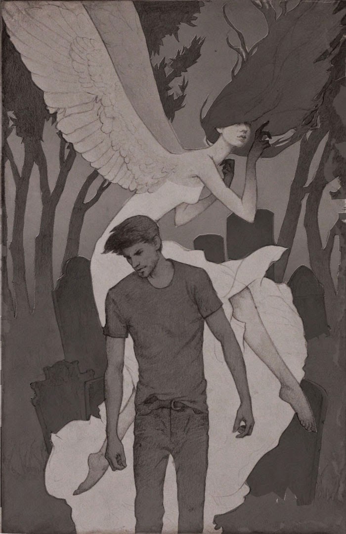
I decided to make the painting 15x22". So, I printed out the digital drawing that size, I had to do it in pieces and taped it together. I then, used transfer paper to transfer the basic composition and lines to my drawing paper so I wouldn't lose the nuances of the composition I had worked out on the computer. Then I drew the whole thing by hand looking at my photo reference on the computer and stylizing the drawing further as I went. 

I showed it to Rebecca and she recommended some small changes to the body by narrowing the shoulders and the waist and widening the hips to give a more feminine form. She also recommended more fullness in the skirt to balance out the hair. Below is the final drawing with the corrections:


My value studies, we went with the one bottom right corner: 


I mounted my drawing onto a 3/16" plywood board with matte medium, then started painting values  in acrylic paint in muted browns. While I was working on my underpainting I painted over a photo of my drawing to do some color studies. I tried a variety of color palettes, but I wasn't feeling right or certain about any of them.


Then my underpainting was finished, shown below:


I took a picture of it and then used it to make even more color studies. After my husband saw them he decided to try playing with the colors on one of them and came up with some interesting options. Then I played with the ones he had played with and came up with the large one, below:


I love what comes out when my husband and I have some back and forth about a piece of art that I am working on! So working from that, I glazed in my colors in oil paint over my acrylic underpainting.  The face lost the look of the drawing during the painting process and I had to paint it out, redraw it, and paint it again. I showed it to Rebecca, she suggested a few minor tweaks and here is the finished painting:


Wednesday, October 29, 2014

SmArt School so far


I signed up For SmArt School earlier this year. There were many great artists to chose from but, since you only get to pick one, I signed up for Rebecca Guay's class. You also get to monitor one other artist's class, I ended up going with Scott Fischer. Class started in September and we were given our first assignment a week or two before class so we would have something to show Rebecca during class. She gave us some interesting photographic portraits to draw from so that she could see where we were at in our skill level. In spite of the fact she also said we could use the reference as "a leaping point" I took that to mean adhering to the reference as closely as possible. So here is what I sent her:


So other than randomly adding antlers to the girl. I followed what was in the photos pretty strictly.
Rebecca worked right on top of the one on the left in Photoshop and talked to me about distortion and stylization, so next I came back with this:


And also we talked about color studies based on other artists' paintings we liked.


So we picked the second study on the bottom and I did an underpainting in acrylic...


And then, continued painting in thin glazes of acrylic colors to slowly build up the color without losing the drawing and values. I brought what I thought was a finished painting and Rebecca made a few suggestions on how to resolve the painting completely. They were really tiny adjustments but made a huge deference! So here is the finished result below:


It's great to watch the critiques of all the students in class. Seeing everyone's ideas and work is very inspiring. Scott Fischer also has so great input for his students and has some good information for working in Photoshop as well as in traditional media.

Wednesday, September 4, 2013


I have really wanted to paint a portrait for a while now. Well I have finally done it. Next time, remind me not to use gouache though. I thought it would make for easier clean up- and it did. But man! It is ridiculous to make good color and value transitions! I already knew this, but I went ahead and did it anyway. If you have ever used gouache you know what I am talking about. The value changes as it dries. The darkest colors get lighter, the lightest colors get darker, and everything in between shifts too! well some how I got through it and came out with a decent looking piece. Not a perfect representation of my oldest son, but it's  pretty close. I particularly like how well the ear turned out. Below is the drawing under all that paint.


LinkWithin

Related Posts Plugin for WordPress, Blogger...